Kaycart

Kaycart

Industry

E-Commerce / Retail

My role(s)

Product Designer

Platform

Mobile App

Timeline

4 weeks

Most e-commerce apps treat depth and speed as a tradeoff. More categories means more filters, more steps, and more friction, and most apps accept this as the cost of scale. Kaycart was built on the opposite bet: that you can stock everything and still get a user from discovery to checkout in four steps.

The design principle was restraint. Every screen was built to resolve in a single, confident action: no nested menus, no repeated forms at checkout, no decision the app could already anticipate. The challenge was removing friction without removing depth.

Shopping apps that slow you down

Most e-commerce apps are built for catalogue scale, not for people. Thousands of products, nested categories, filters that take multiple taps to configure, and checkout flows that ask for the same information every time. The result is an experience that feels more like a warehouse than a shop.

The second problem is product confidence. Names are truncated, descriptions are sparse, and there is no clear signal on stock status or popularity. Users add items without being sure they are getting exactly what they want, and returns follow.

Kaycart addresses the flow problem first. Every step from finding a product to completing checkout is designed to resolve in a single, confident action — no redundant inputs, no dead ends, no re-entering information the app already has.

It addresses confidence next. Every product page gives users the full picture before they commit: a detailed name, rich description, and status chips like Best Seller and Almost Sold Out that answer the questions users would otherwise have to search for.

Both of these are backed by one guarantee: if an order doesn't arrive within the committed delivery window, the user gets a full refund. No claims process. No chasing support. When you select a delivery time on Kaycart, it means something.

Onboarding and Home

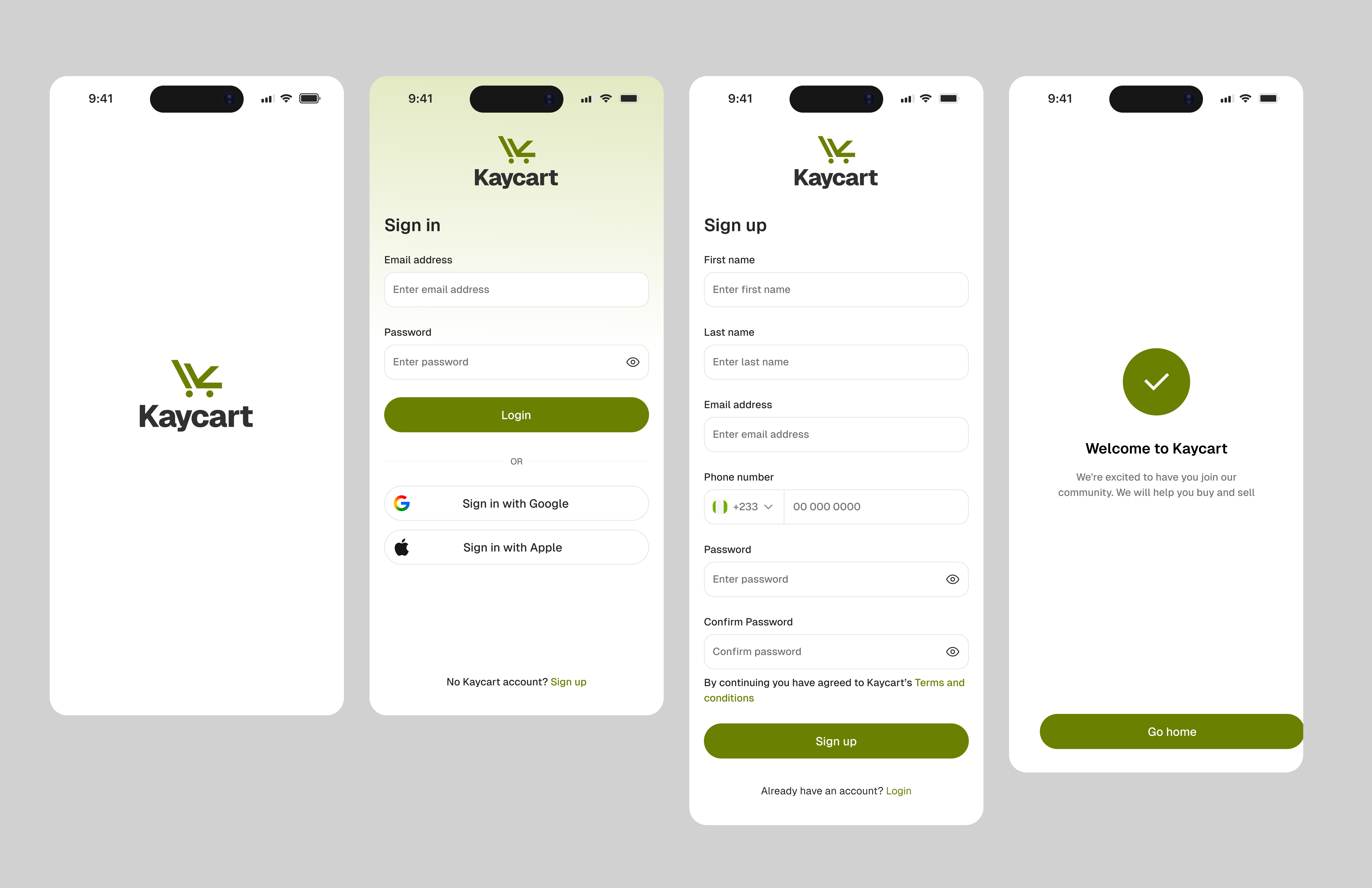
Onboarding is kept deliberately short. Users only need to provide the basics to get started, and sign-up is supported via Google and Apple SSO so the barrier to entry is as low as possible. No lengthy forms, no friction before the product has had a chance to earn the user's attention.

One real dilemma was whether to collect a delivery address at onboarding. Collecting it early means a smoother first checkout experience. But asking for that information before a user has seen a single product, or built any trust in the platform, risks losing them before they have a reason to stay. The direction taken was to defer it entirely. Users add an address in their profile or during checkout, at the point where they have already engaged with the product and are ready to commit.

Kaycart onboarding

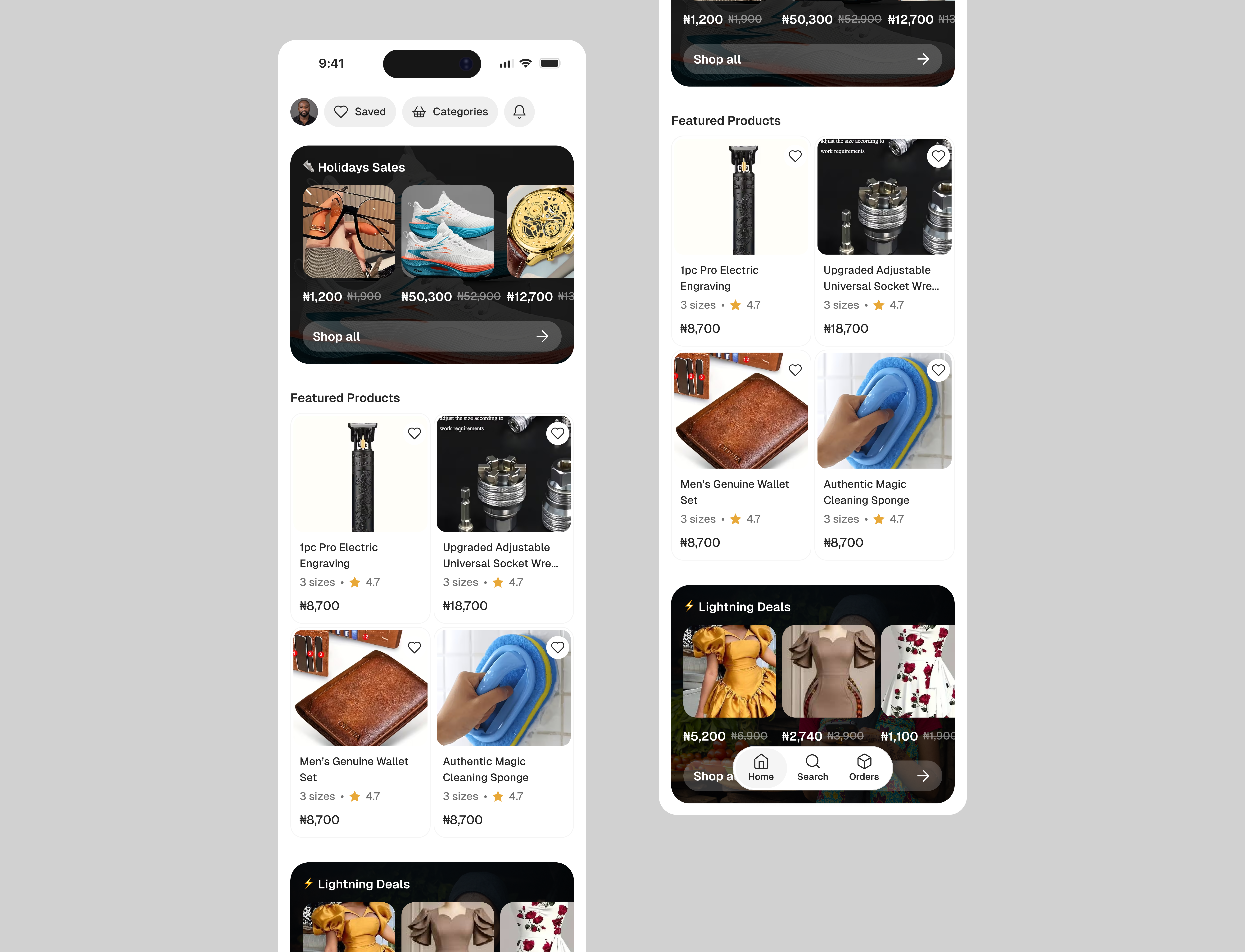
The home screen serves as the primary discovery surface. It leads with curated category tiles, giving users a clear mental map of what is available without overwhelming them with individual products upfront. Featured items, trending picks, and personalised recommendations are surfaced below the fold, allowing users who know what they want to navigate immediately, and those who are browsing to explore naturally.

The profile icon sits at the top of the home screen, persistent and accessible at all times, so account management, saved addresses, and payment methods are always one tap away without interrupting the shopping flow.

Kaycart home screen

Item Card and Buy Box

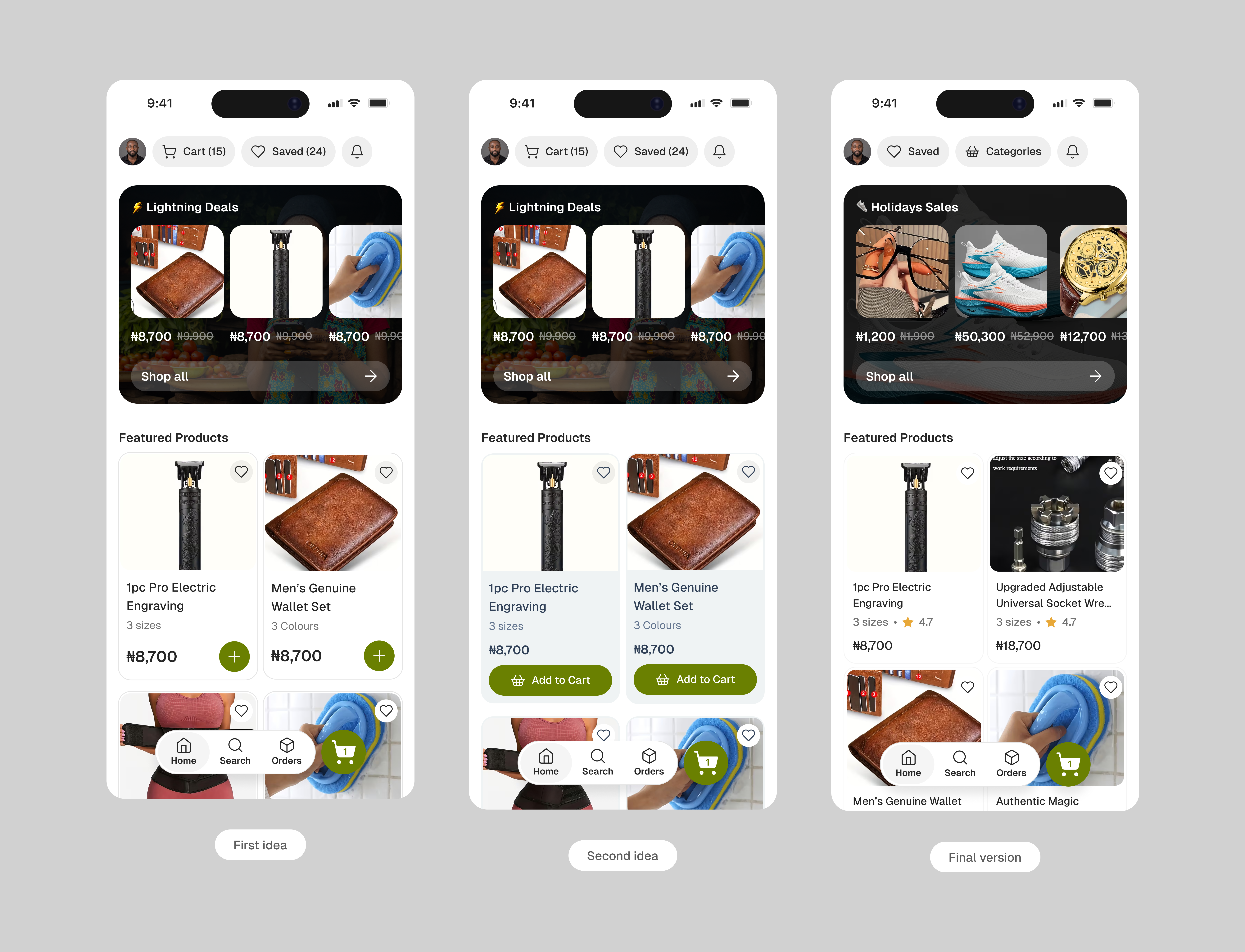
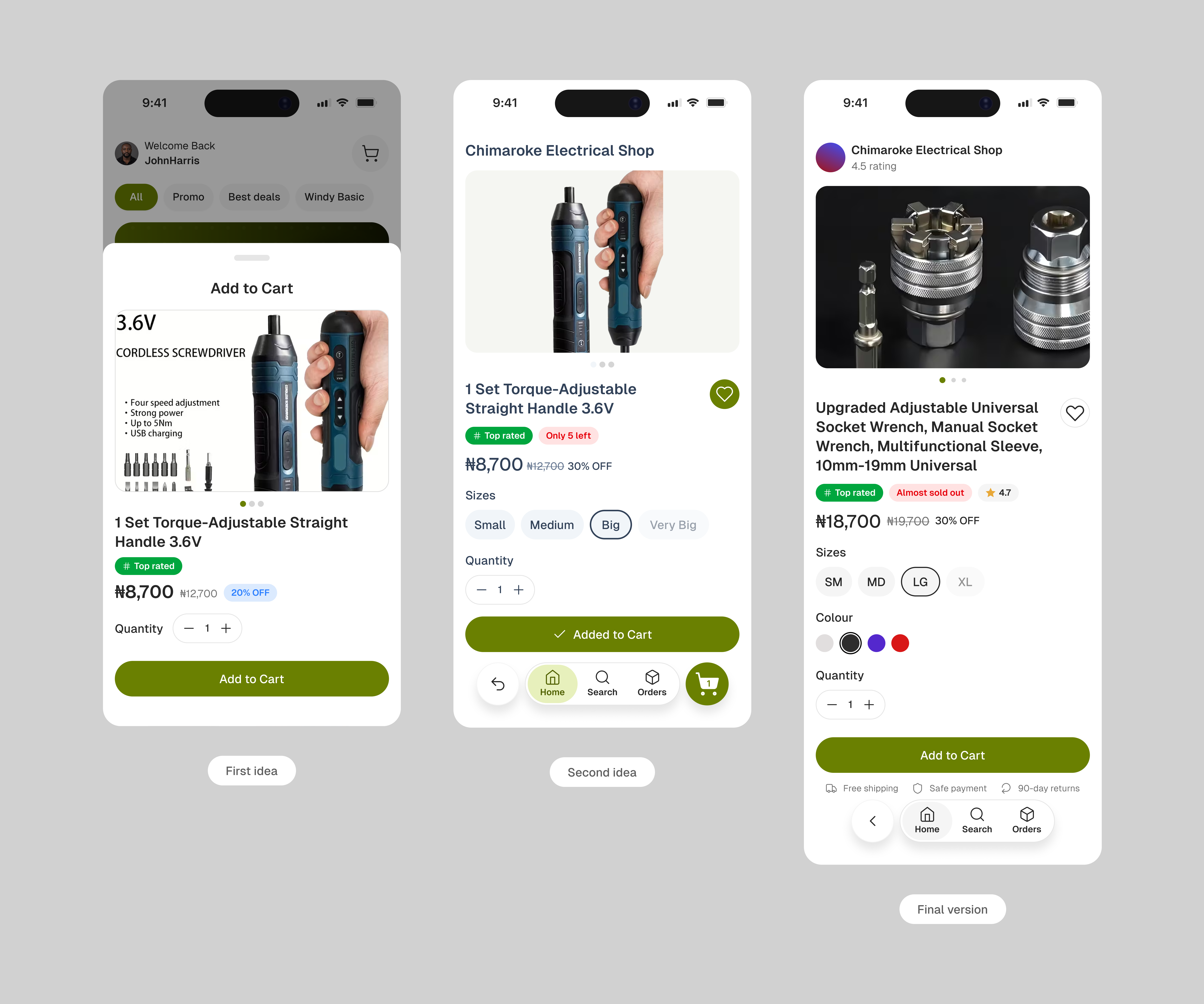
One deliberate decision here was removing "Add to Cart" from the home page product cards entirely. The idea was tested early. A quick action on the card felt efficient, but the dilemma was immediate: what about products with sizes, colours, or pricing variants? Showing a bottom sheet of sub-options before adding defeated the purpose of a fast action, and hiding those options led to incorrect cart entries. The solution was to remove the shortcut altogether. Users tap the product, land on the detail page, make their selections (size, colour, quantity) and then add to cart or buy now with full confidence. This approach reduces confusion, keeps the home screen clean, and mirrors what data from apps like Shop supports. Apps like Temu and Jumia take the modal route. Kaycart does not.
Kaycart item card

The buy box was designed carefully after studying how users evaluate and commit to orders. The product name is explicit and descriptive, not a truncated label. It gives the user a full picture of what they are buying before they scroll any further. Additional images are included so users can examine the product from multiple angles. This builds confidence and reduces the chance of a return caused by mismatched expectations.

Trust badges like "Top Rated" and "Almost Sold Out" are placed prominently alongside other product and brand indicators. Price reductions are displayed clearly so users know they are getting the best available rate. Where multiple pricing tiers exist, the second option is shown as the popular or recommended choice. Attributes like sizes and colours are laid out as selectable options. A quantity field is always in view.

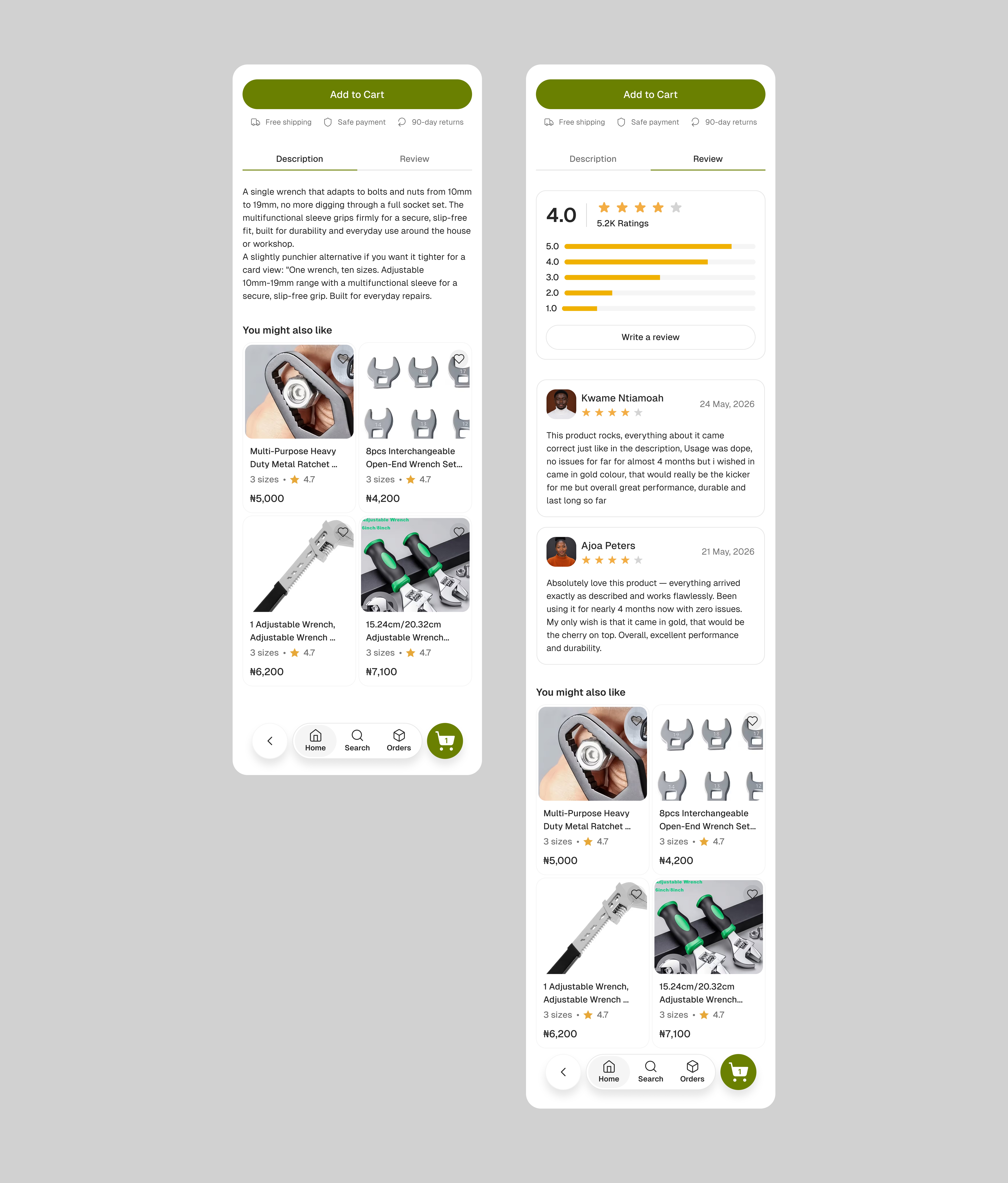
Below the buy box, a set of trust indicators reinforces the decision: free shipping where applicable, secure payment assurance, a general 90-day return policy on goods, and a full refund guarantee if the committed delivery window is missed. Together, these give users confidence at every stage of the commitment: they know what they are getting, what it costs, when it arrives, and that Kaycart backs that up if anything falls short.
Kaycart buy box Kaycart item card 2

Search & Categories

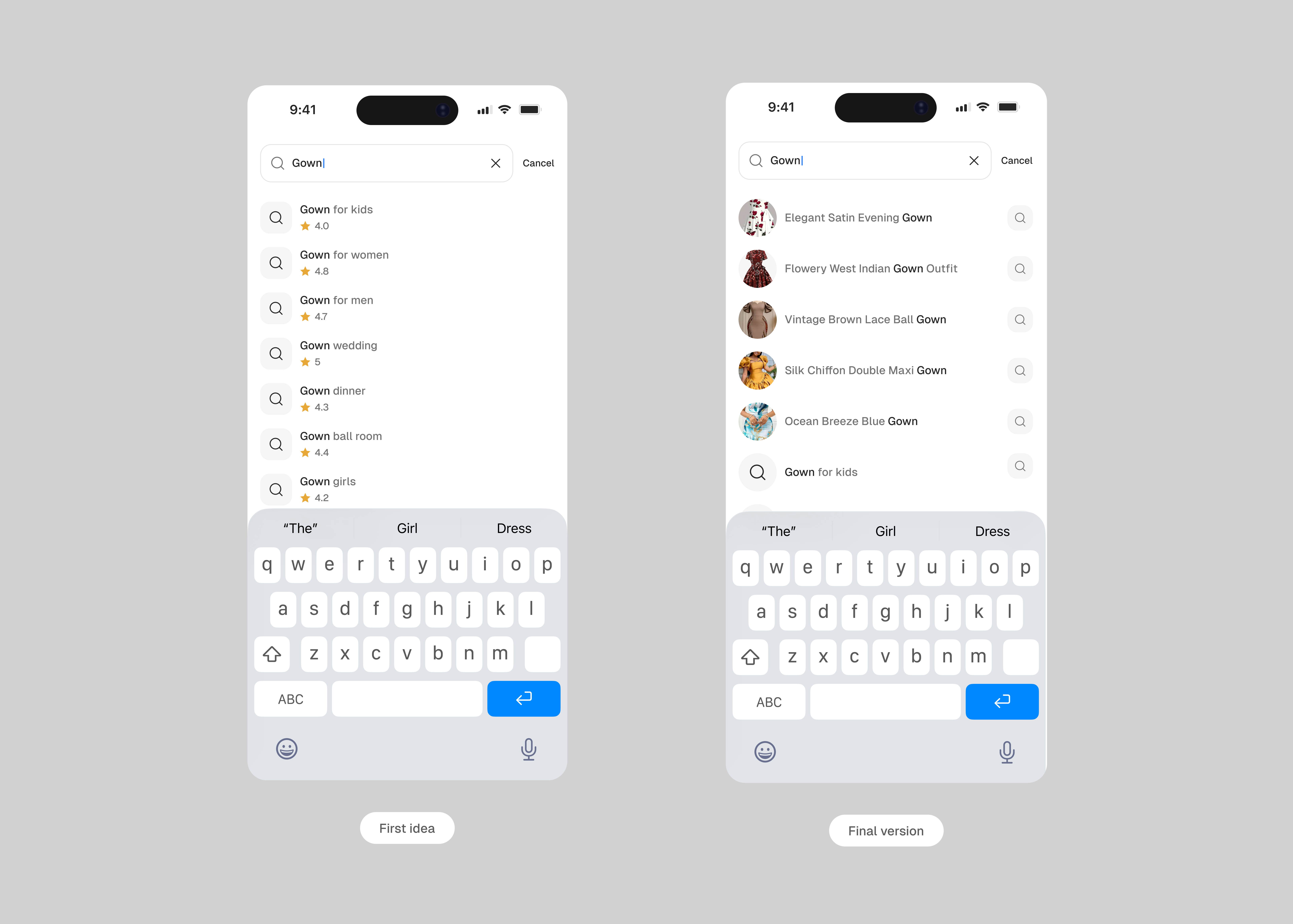
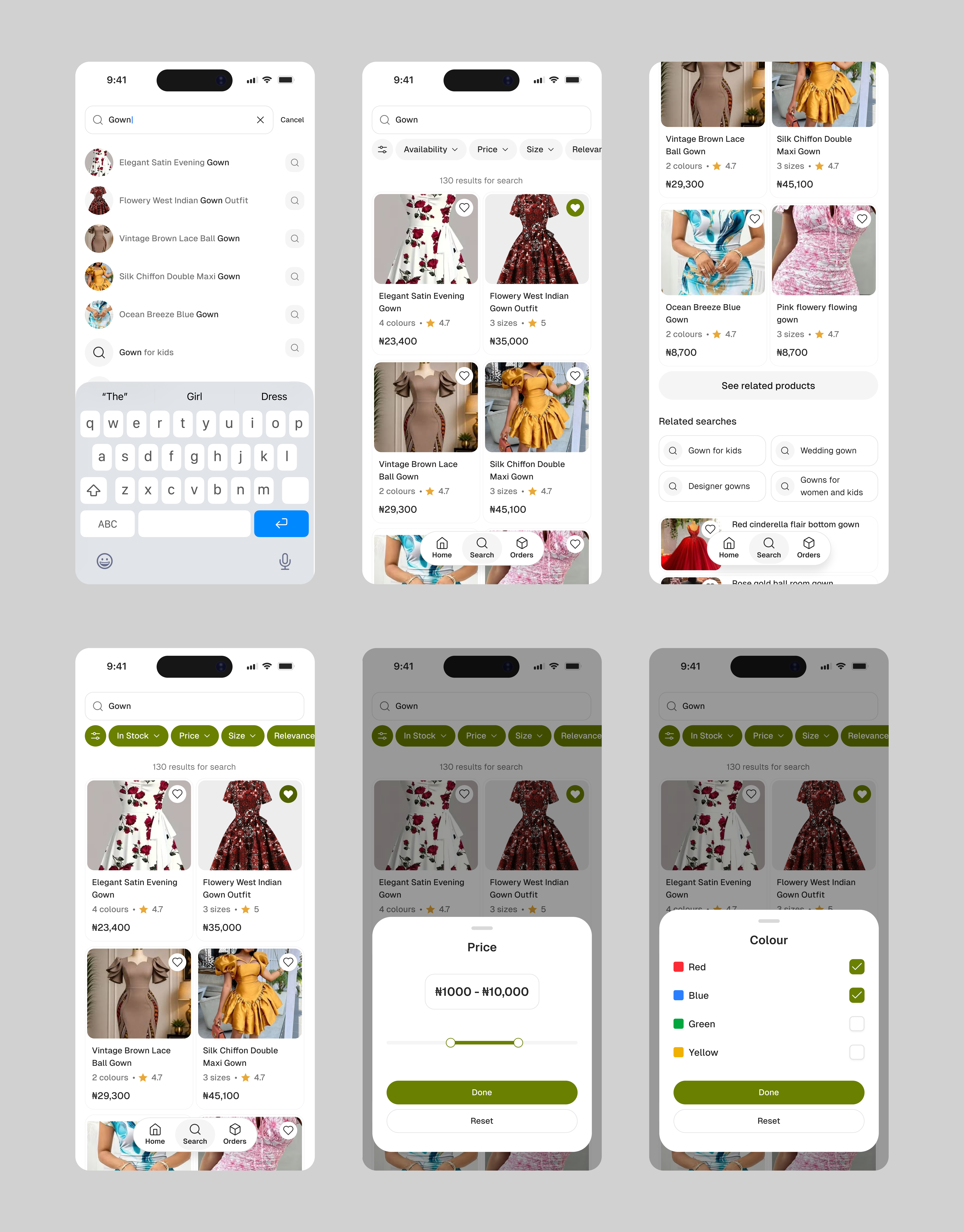
The first idea for search was a text-heavy results list: product names, ratings, and basic details with no images. The thinking was that stripping back visuals would keep results fast and scannable. Testing revealed the opposite: users took longer to evaluate results and were less confident in what they were looking at.

Kaycart search primitive

The approach was revised. Research consistently shows that shoppers make decisions significantly faster when product images are present. A thumbnail is often enough to confirm or dismiss an item before reading a single word. Eye-tracking studies across e-commerce platforms show users fixate on images first, then price, then name. The search results page was rebuilt around that behaviour: images lead, details follow.

Kaycart search results

Once a search is triggered, users have access to a robust set of filters and sort options: availability, price range, colour, size, ratings, and relevance. Results can be ordered from highest to lowest price or sorted by rating. Related searches are surfaced alongside results to capture adjacent intent, giving users a nudge toward products they might not have searched for directly but are likely to order.

One feature that was scoped out was AI-powered search filtering. The intent was to surface smarter, intent-aware results without the user needing to configure filters manually. The complexity of getting it right made it a later consideration. The current filter set covers the core use cases, and the foundation is there to layer it in when ready.

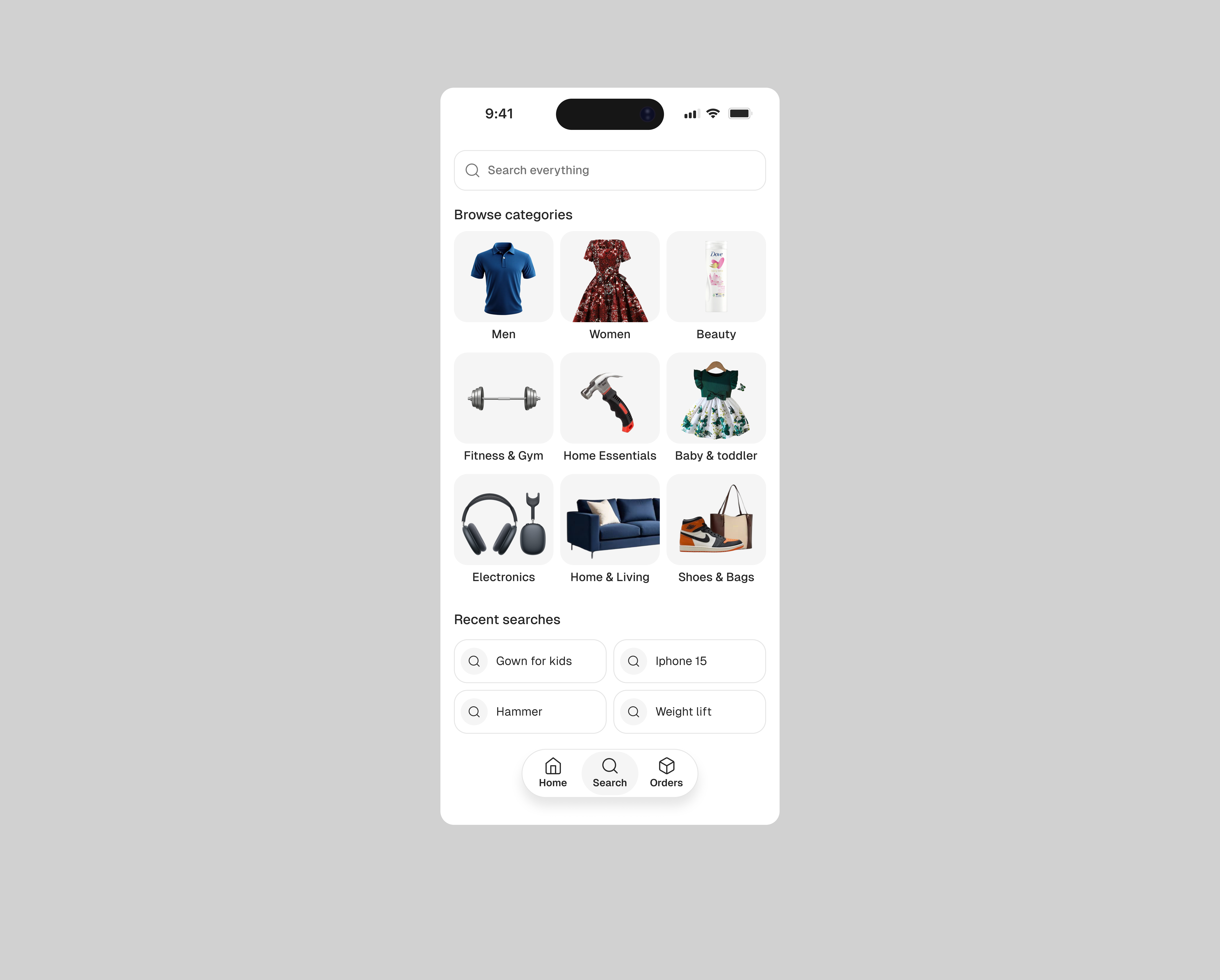
Categories on the home screen feed directly into the search page, where products are displayed as browsable cards. This was a deliberate structural decision: selecting a category is the same intent as typing a keyword. The user is narrowing down to a product type and scanning results from there. Routing both through the same surface keeps the experience consistent and avoids a separate browse flow that would behave identically but feel disconnected.

Kaycart category browsing

Cart & Order Management

The cart view is intentionally minimal: item, quantity, price, and a clear path to checkout. Users can adjust quantities or remove items inline without a separate edit mode. Order tracking is surfaced in the same tab, so users have a single place to manage both pending and active purchases.

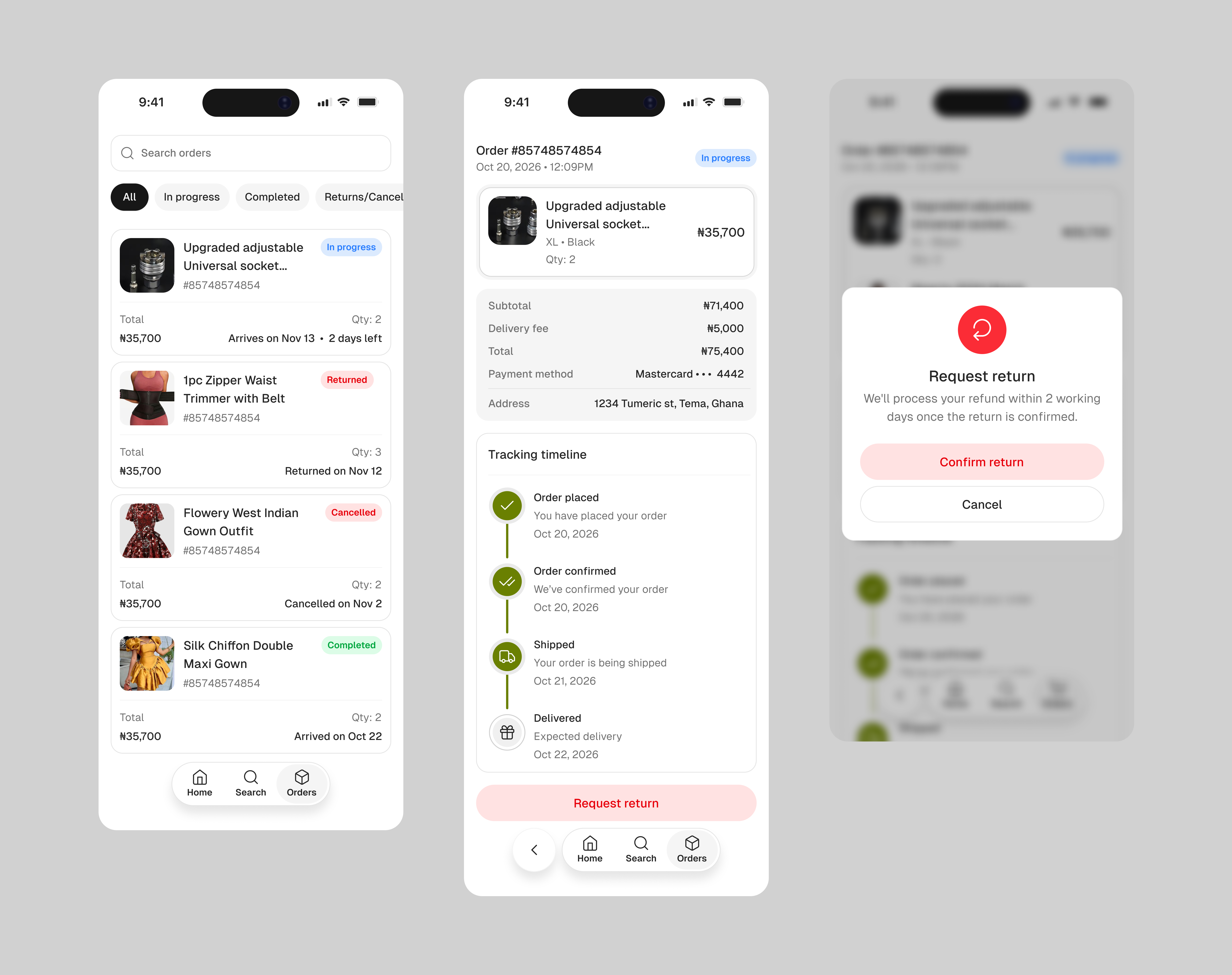
Orders are grouped into four clear states: All, In Progress, Completed, and Returns/Cancellation. Returns and cancellations were kept separate from the rest because they represent meaningfully different situations. A return is an order that was completed and then sent back. A cancellation is an order that never shipped and where the user was refunded. Both are grouped under the same tab but distinguished by different red badge variants, so users can tell at a glance which type of issue they are looking at without needing to open the order.

Kaycart order management

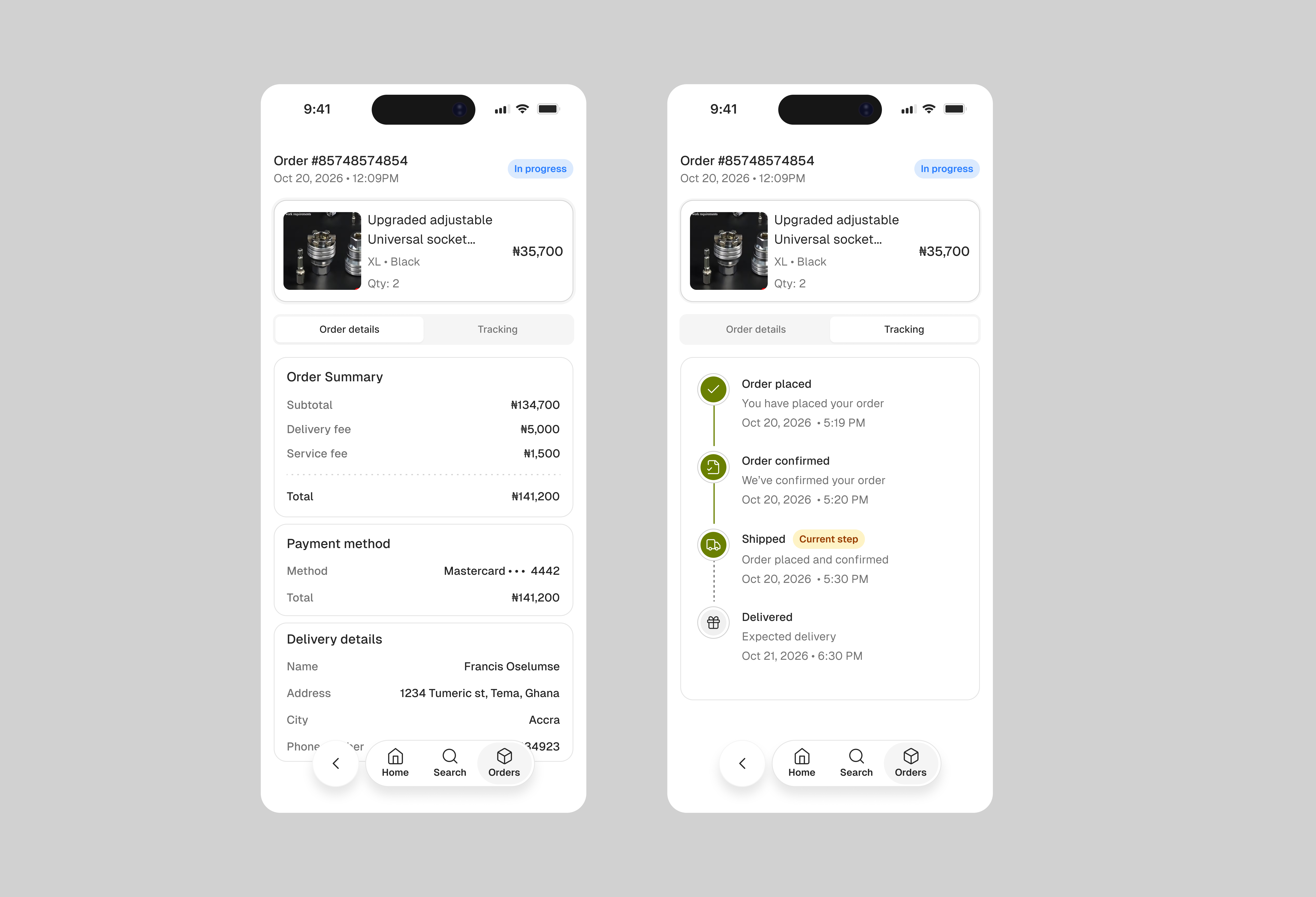
The initial idea for the order details page was to have a segmented control between order details and tracking, showing distinctively different content under each tab. That was revised after internal testing showed it was unnecessary. Users were more concerned about tracking. The pages were merged. Tracking took precedence while only the most relevant order information was kept: subtotal, delivery, payment method, and address.

Kaycart order management primitive

Checkout

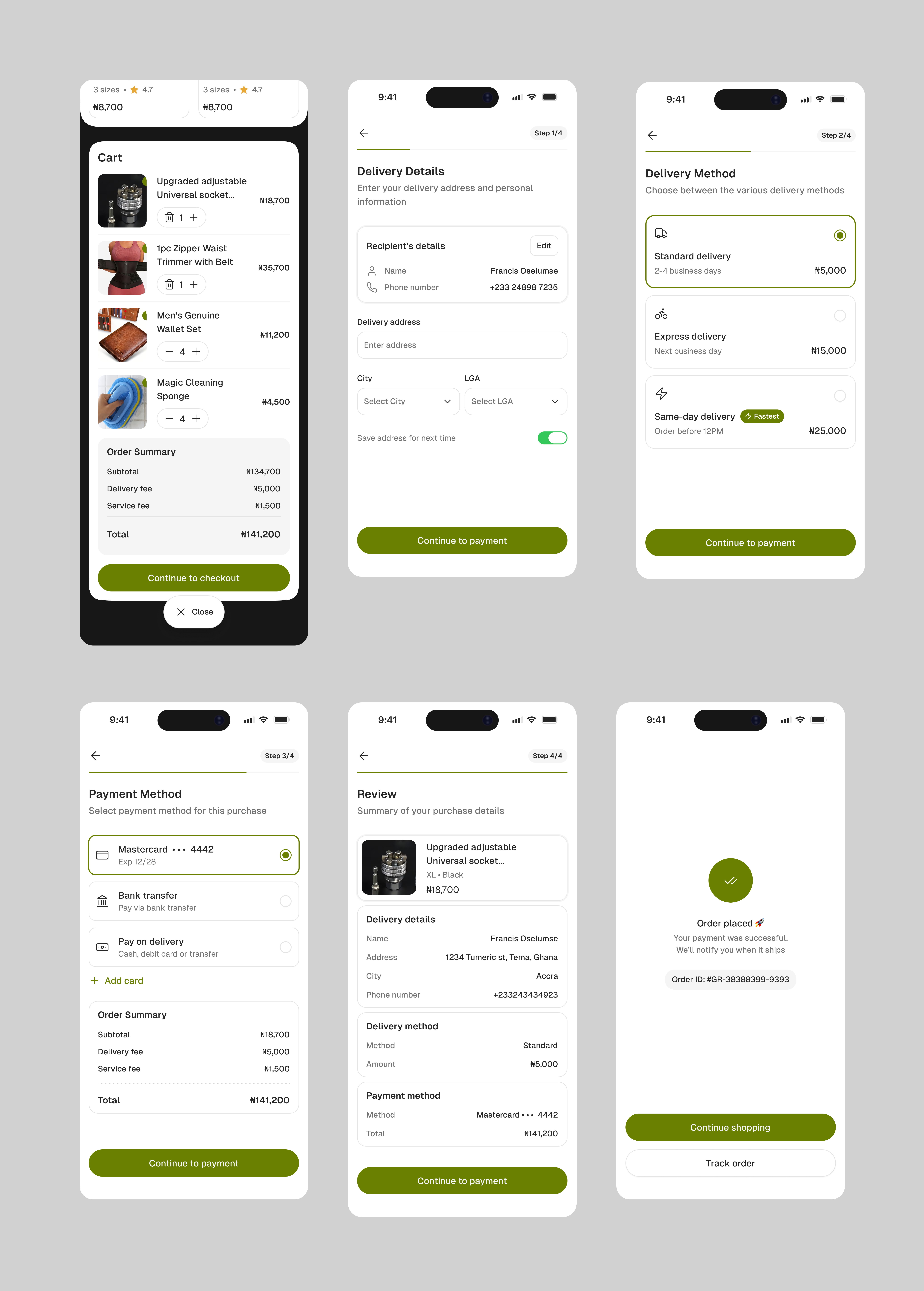
Checkout is the most critical flow in any e-commerce product, and Kaycart's is designed to be completed in four steps: review cart, confirm delivery address, select delivery type, confirm payment. Each step is a single focused screen with one primary action.

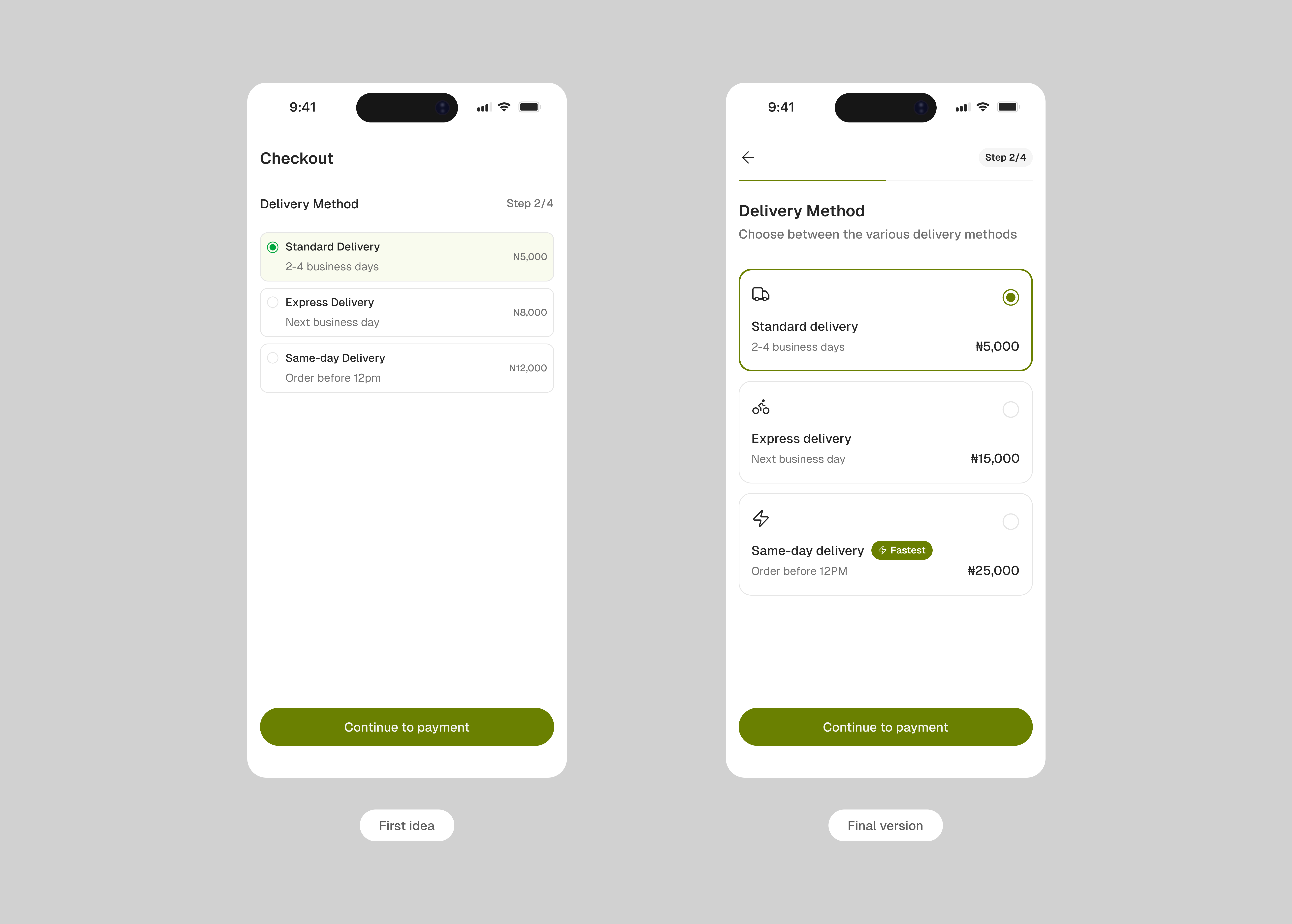
Delivery type selection gives users three meaningful options: standard, express, and same day delivery. Each is displayed with a clear timeline and pricing so the decision is easy to make. If the committed window is missed, users get a full refund, turning the delivery selection from a logistics choice into a real promise. Returning users land on their saved address and preferred payment method by default, making repeat purchases significantly faster.

Kaycart cart and order

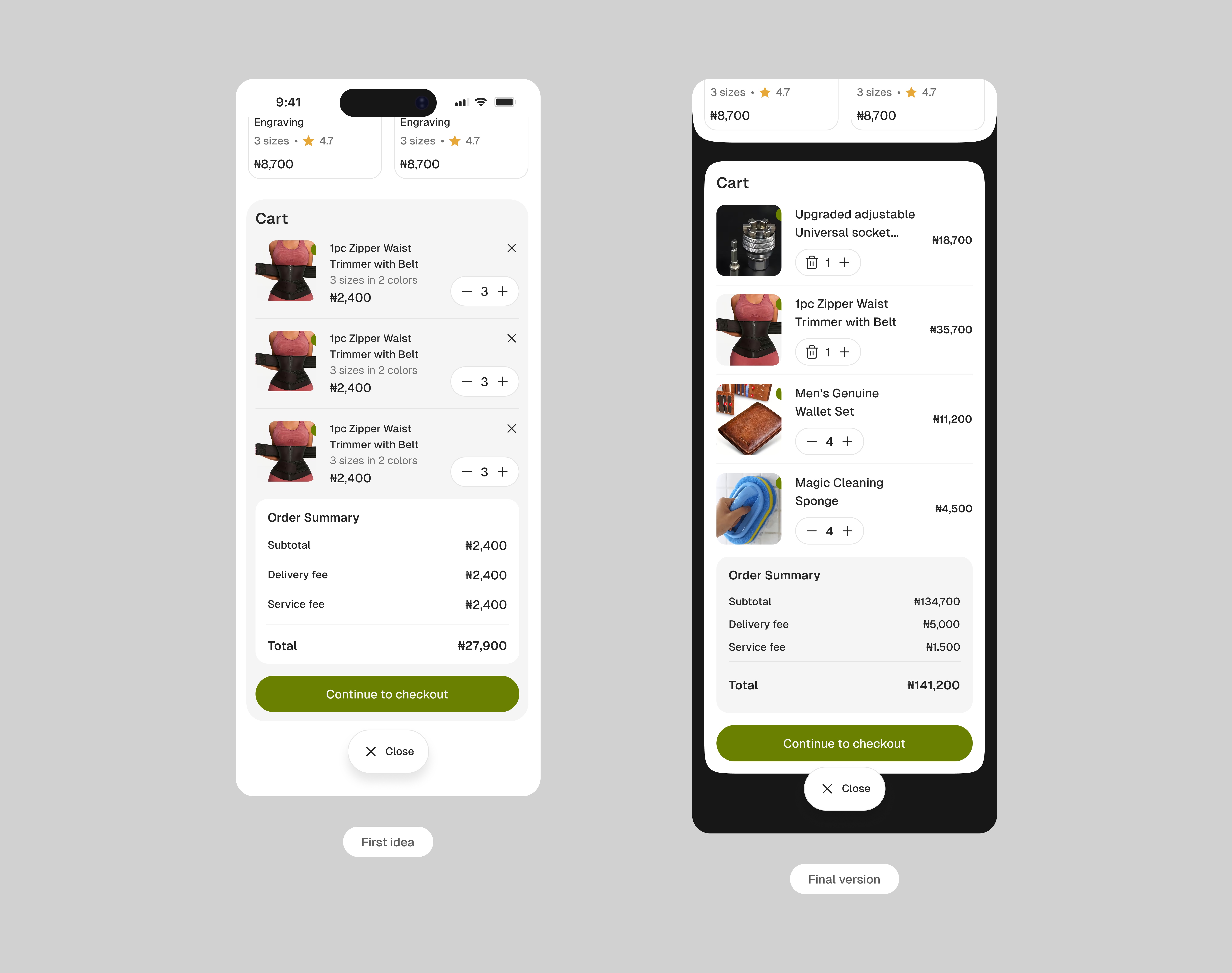
For the cart, the initial idea was to have the page slide up as a sheet so the cart appears from below. Users could view the full item details: name, colour, size, and other attributes, along with a standard quantity stepper and an X button to delete an item. Everything sat on a light grey muted background to frame the content. This was later revised. The background was darkened to increase readability, and the cart details were placed on a white background to create stronger contrast. A close button lets the sheet slide back down to dismiss.

Kaycart cart sheet

The checkout delivery method UI was reworked to use a black active state, making the selected option immediately clear. A progressive disclosure approach was applied so only the relevant details for the selected method expand into view, keeping the screen clean and focused.

Kaycart delivery method

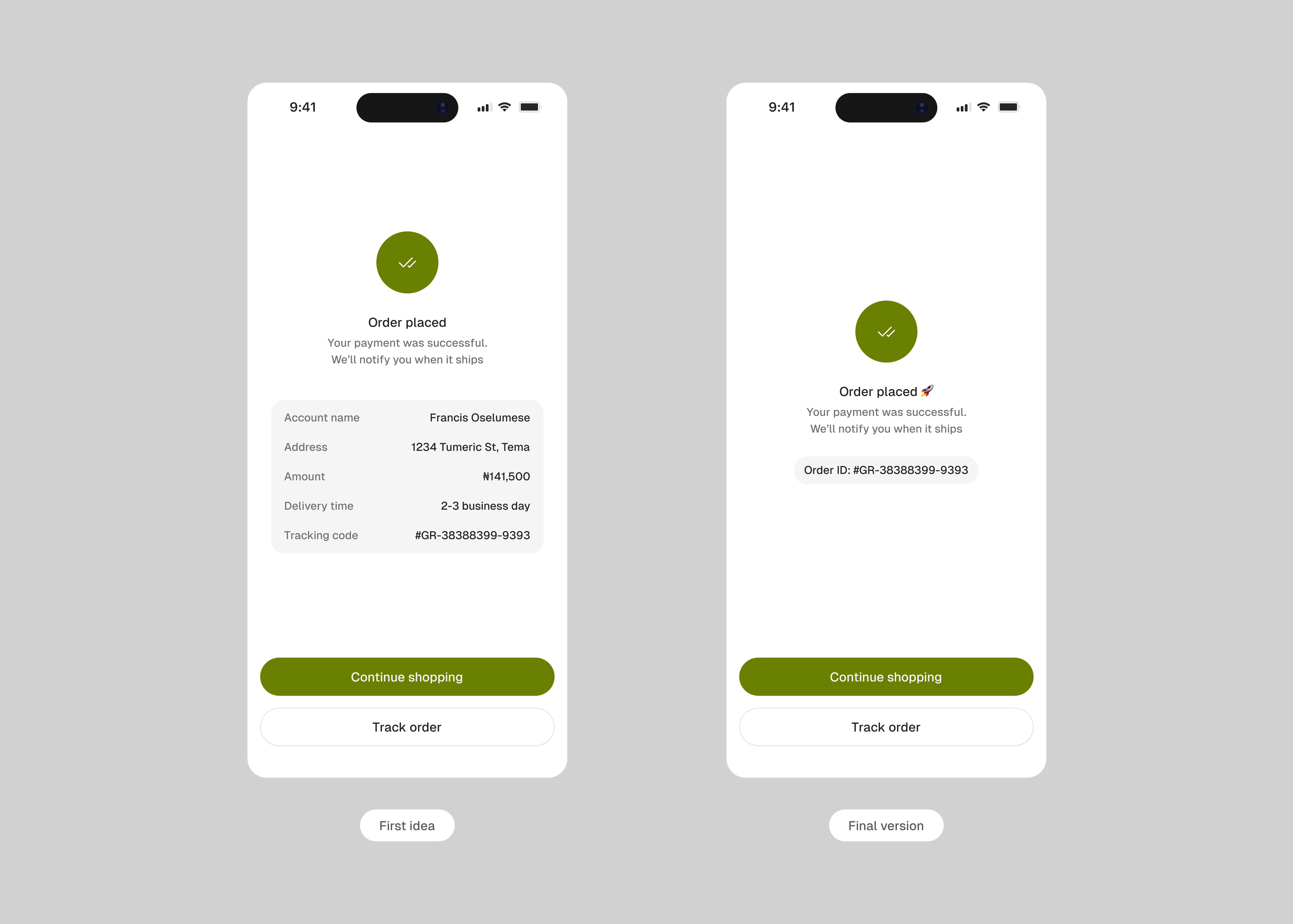
The confirmation screen in the earlier version repeated order details the user had just reviewed and submitted, which felt redundant. That content was stripped out. In its place: a unique order ID for reference and a secondary "Track Order" button for users who want to follow up immediately. Everything else is out of the way.

Kaycart confirmation page

Profile

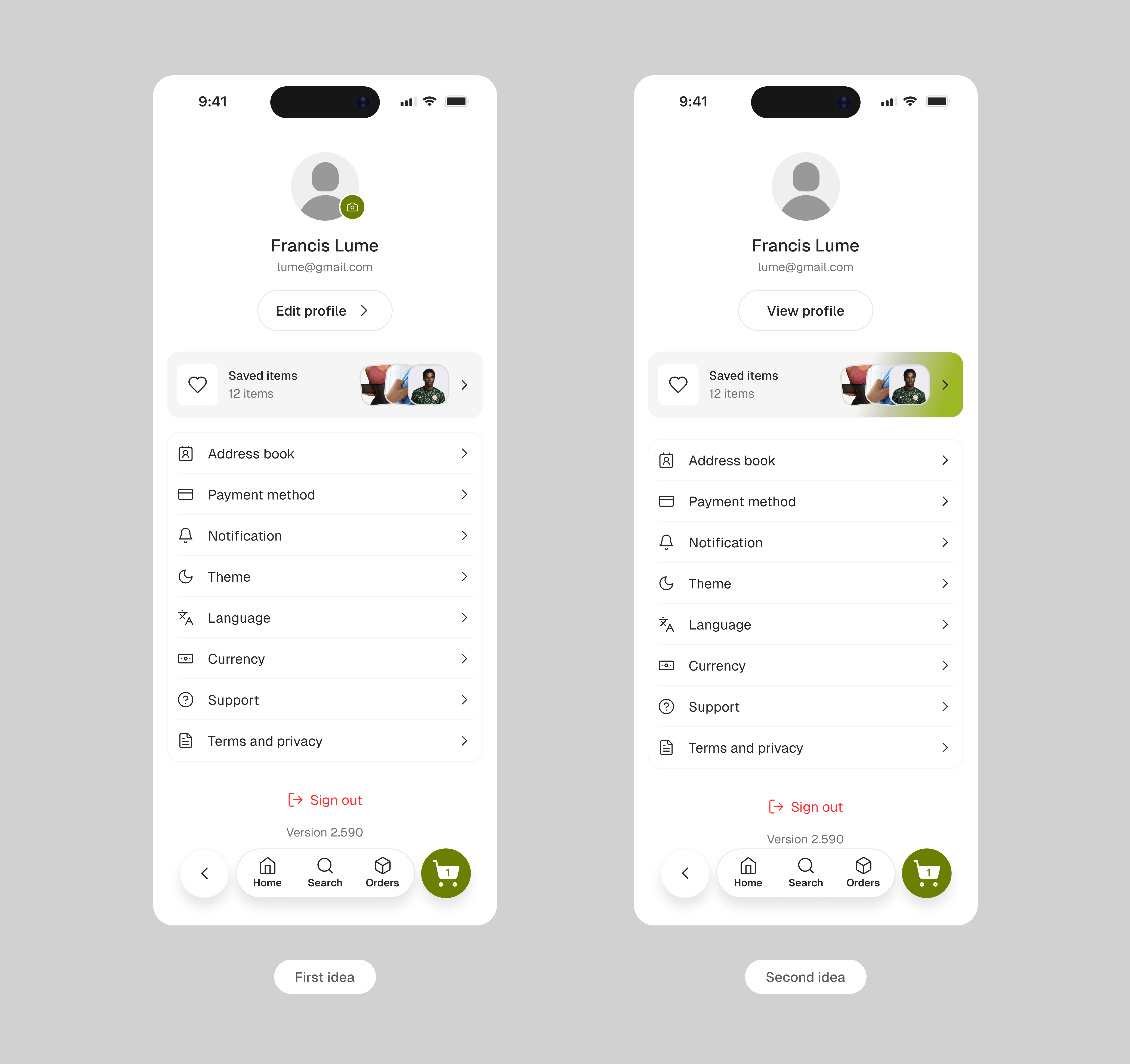
The profile section, accessible via the top icon on the home screen, consolidates everything account-related: saved addresses, payment methods, order history, notification preferences, and account settings. A saved items card sits prominently just above the rest of the navigation menu, giving users a clean, visual way to revisit products they have shown interest in. The section is designed as a utility space, functional and fast to navigate, not a feature in its own right.

The first version of this page was designed with clarity as the priority. The saved items card sat at the top, showing actual thumbnail images of what the user had saved as a visual reminder of what was there. The bottom navigation laid out all relevant components cleanly. It worked, but it was missing a touch of personality. I also designed the edit profile button with a matching icon to keep the interaction feeling intentional.

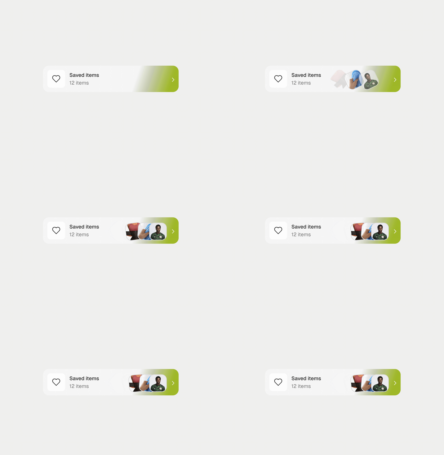
Version two pulled back on the edit profile button entirely, replacing it with "View Profile" where all edits could happen in one place. I introduced a light green gradient to the saved card as a way to bring in a touch of elegance and brand presence. It added warmth, but the card soon felt like it was pulling too much attention so I reworked it again.

Kaycart profile page

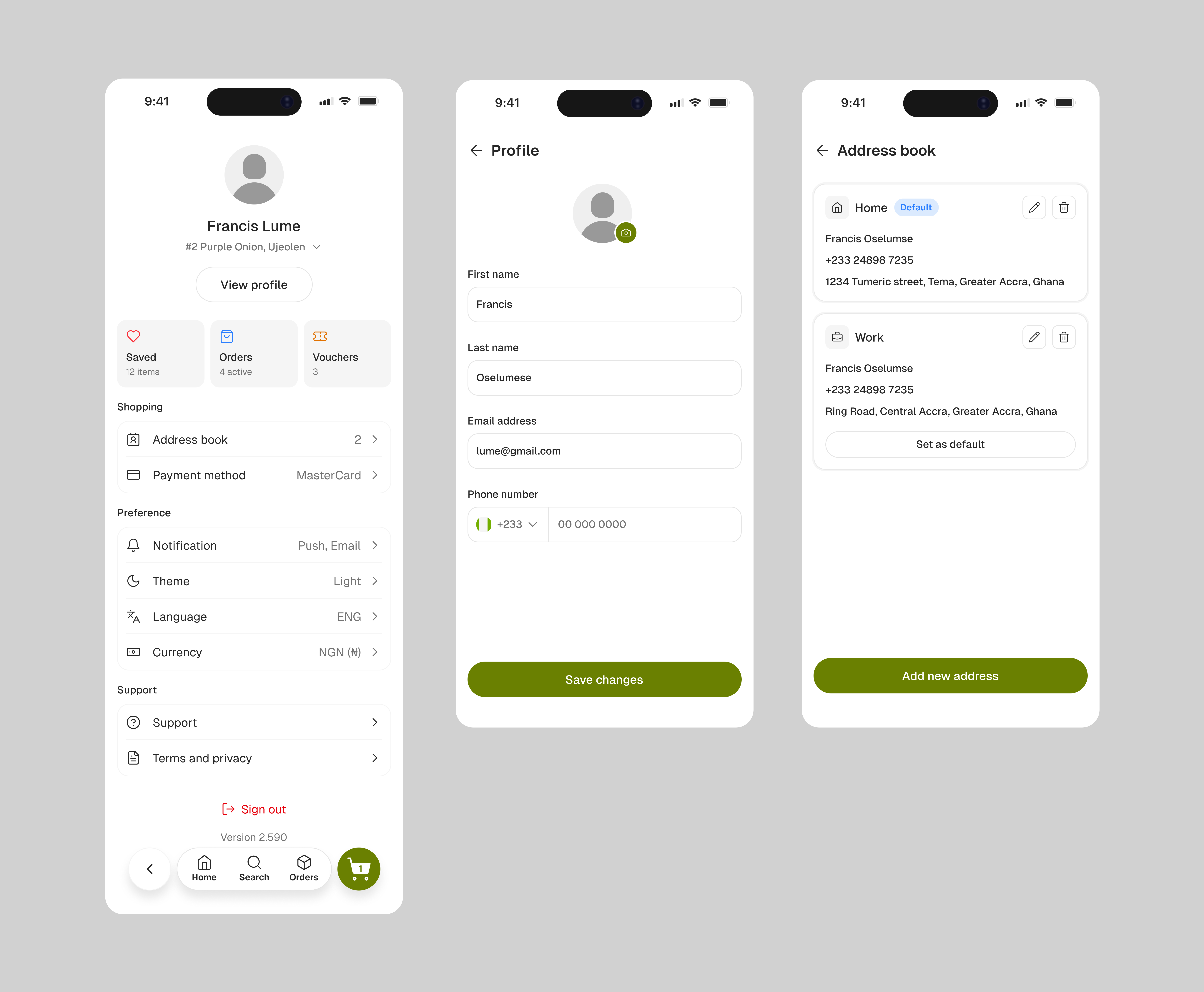
The final version settled on a labelled settings structure. Each section is titled clearly: Shopping, Preference, and Support. What makes it work is the subtle supporting text beneath each menu item showing what is currently selected. This increases affordance and saves the user an extra tap just to check their current setting.

The card under the header section was also redesigned into three distinct cards: Saved, Orders, and Vouchers. This brings the two most relevant actions, saved items and active orders, directly in front of the user, with vouchers as a natural third. The remaining screens include a full profile page where the default delivery address sits just below the user name, alongside the rest of account details, and an address book where users can add, edit, delete, and set a default delivery address.

Kaycart address book

Interaction animations designed for the project

Kaycart motion 1 Kaycart motion 2 Kaycart motion 3 Kaycart motion 4

Kaycart is designed to collapse the typical e-commerce journey into a focused, fast experience. Four steps from home screen to confirmed order, with payment and delivery that feel like natural endpoints rather than hurdles.

<60 seconds Returning users, home screen to confirmed order. Four steps, one direction.
Pay your way Cards, mobile money, and bank transfer all supported. No user should reach checkout and find their preferred method missing.
Buy box Trust signals, price clarity, and variant selection on one screen. Designed to reduce hesitation and push confident add-to-cart decisions.
Restraint is a design decision.

Every feature has a version that could have been more: nested sub-categories, quick-add on cards, address at onboarding, AI search filtering. None made it in. Each added steps, introduced edge cases, or asked something of the user before they were ready. The discipline was shipping the version that felt fast, not the one that felt complete.

Know what to cut and when.

AI-powered search filtering was descoped due to implementation complexity. Address collection at onboarding was cut because it serves the product, not the user — someone who hasn't seen a single item has no reason to hand over a delivery address yet. Both came down to the same question: does this serve the user right now, or does it serve us?

Don't shortcut a decision that needs context.

I tested an "Add to Cart" button on home page cards. It felt fast until products with size or colour variants broke the pattern — either users add the wrong thing, or a modal appears first and kills the shortcut. I removed it entirely. Users configure on the detail page and commit in one action. No ambiguity.